「flexboxの基礎」は、
よくわかる「flexbox」基礎編(1)ヨコ方向(html,css)
こちらをご覧ください。
こんにちは、tanakaです。
今回は「flexboxプロパティ群」の説明です。
「flexbox」は、とても難しくできています。
しかし
ページを作る上で必要です。
ここは踏ん張りどころです。頑張って覚えてみましょう。
「flexbox」とは、
子要素をキレイに並べるプロパティです。
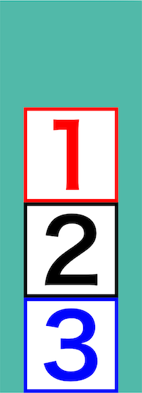
「flexbox」を覚えれば下の画像のような面白いこともできます。
「flexbox」は、
タテ、ヨコ、折り返しなどさまざまな並べ方ができます。
それでは、
詳しく説明していきます。
<コピー、ペーストすると文字化けします>
このページのコードをコピー、ペーストすると
「ダブルクオーテーションなどの一部が文字化け」
して正常に機能しなくなります。
十分ご注意ください。
- 「flexbox」とは?
- 「flexbox」どのように使う?
- 「flexbox」5つの並べ方
- 「flexbox」6種類のプロパティ
- 1:flex-direction(方向を決める)
- 「flex-direction」4つの値
- 2:justify-content(主軸の調整)
- 「justify-content」6つの値
- 3:align-items(交差軸の調整1)
- 「align-items」6つの値
- 4:flex-wrap(折り返し)
- 「flex-wrap」4つの値
- 5:align-content(交差軸の調整2)
- 「align-content」7つの値
- 6:order(個別の並び順指定)
- 「flexboxプロパティ群」まとめ

「flexbox」とは?
「flexbox」とは、
親要素へプロパティを入れ、子要素を並べる機能です。
「flexbox」を使えば「タテ」「ヨコ」へ並べることができます。
しかし
「flexbox」は、
主軸、交差軸など聞きなれない言葉もあり難しくできています。
「flexbox」どのように使う?
「flexbox」は、どのように使うのでしょうか?
おおよそ、この様な形で使われます。
<ヨコ>

display: flex;
flex-direction: row;
justify-content: space-around;
align-items: center;
<タテ>

display: flex;
flex-direction: column;
justify-content: space-around;
align-items: center;
この形が分かれば「flexbox」は、理解したと言えるでしょう。
「flexbox」5つの並べ方
「flexbox」は「5つの」並べ方ができます。
1:ヨコ
2:タテ
3:折り返し(ヨコ)
4:折り返し(タテ)
5:文字の底辺でそろえる
詳しく説明していきます。
<「flexbox」5つの並べ方>
1:ヨコ
2:タテ
3:折り返し(ヨコ)
4:折り返し(タテ)
5:文字の底辺でそろえる
「flexbox」6種類のプロパティ
「flexbox」プロパティは「6種類」あります。
<「flexbox」6種のプロパティ>
1:flex-direction(方向を決める)
2:justify-content(主軸の調整)
3:align-items(交差軸の調整1)
4:flex-wrap(折り返し)
5:align-content(交差軸の調整2)
6:order(個別の並び順指定)
この6種類のプロパティを使って、子要素を並べていきます。
1:flex-direction(方向を決める)
「flex-direction」は、「並び方向を決める」プロパティです。
並び方向は、タテ、ヨコがあります。
「flex-direction」の値は4種類です。
| 値 | 方向 | 並び方向 | ||
| 1 | row | ヨコ | → | デフォルト |
| 2 | row-reverse | ヨコ逆 | ← | |
| 3 | column | タテ | ↓ | |
| 4 | colmn-reverse | タテ逆 | ↑ |
「reverse」という並びが逆になる値もあります。
しかし
並びは「html側」で変えた方が良いでしょう。
「flex-direction」4つの値
「flex-direction」の値です。
それぞれ画像で紹介します。
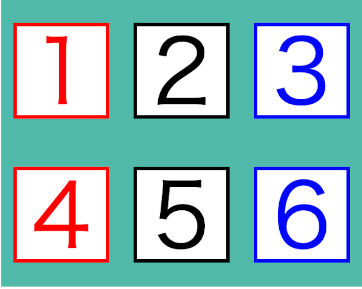
<ヨコ方向>
flex-direction: row
「row」は、ヨコ方向に並べます。

flex-direction: row-reverse(逆方向)
「row-reverse」は、ヨコ方向で逆方向に並べます。
右から左へ。

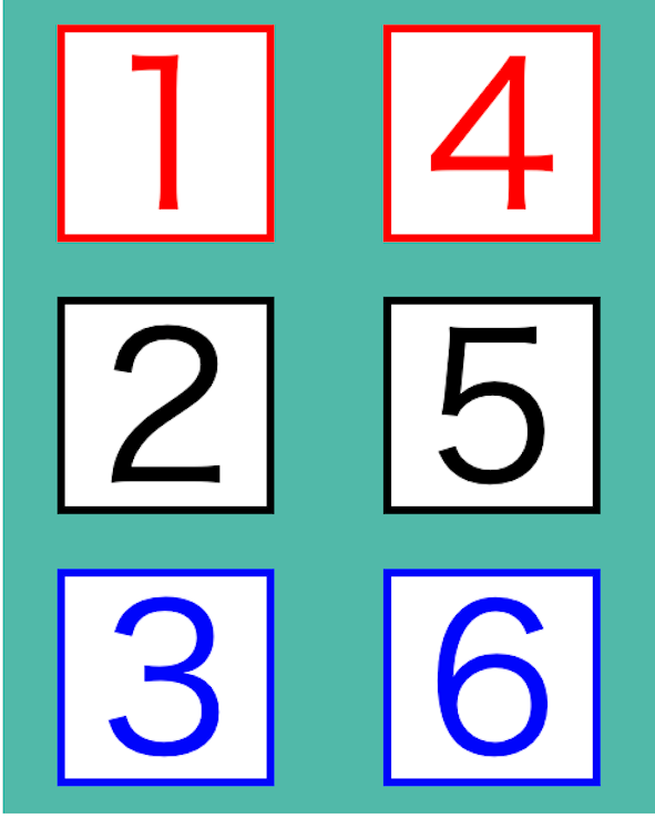
<タテ方向>
flex-direction: column
「column」は、タテ方向に並べます。

flex-direction: colmn-reverse(逆方向)
「colmn-reverse」は、タテ方向で逆方向に並べます。
下から上へ。

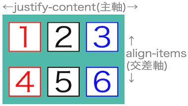
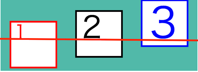
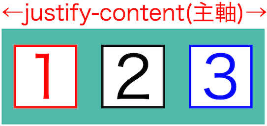
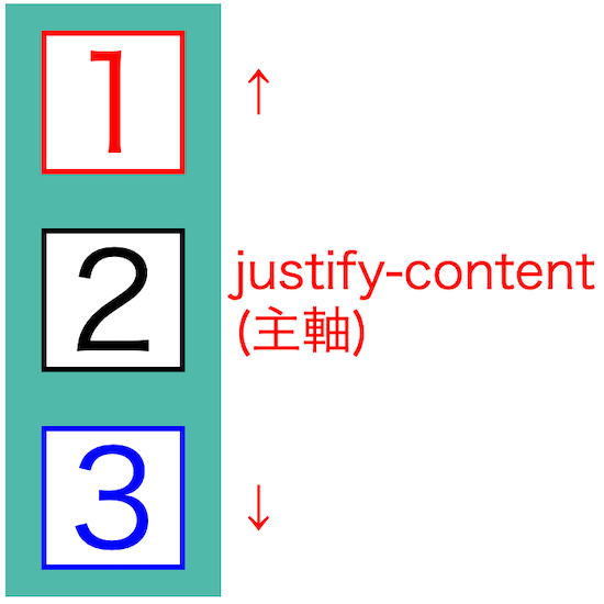
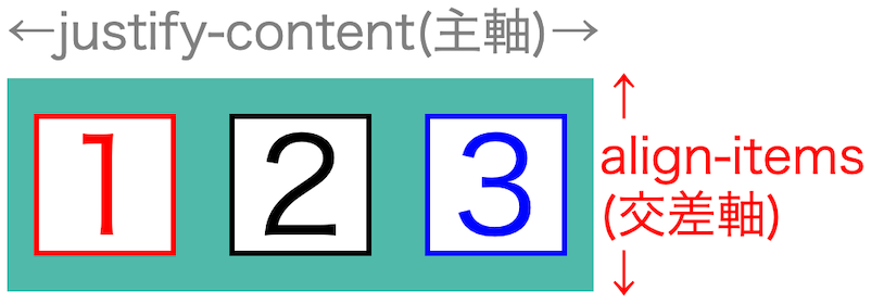
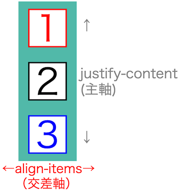
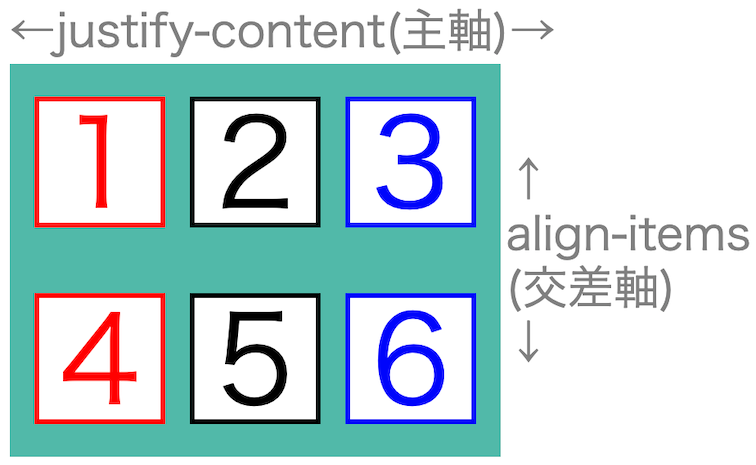
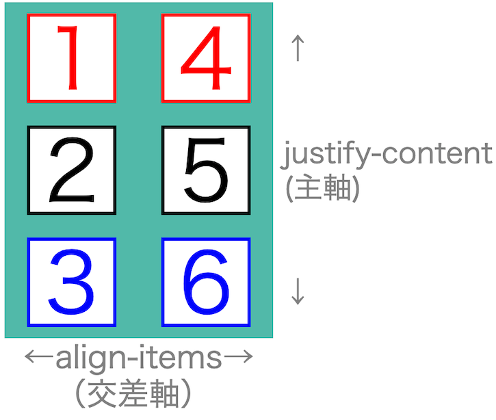
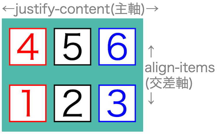
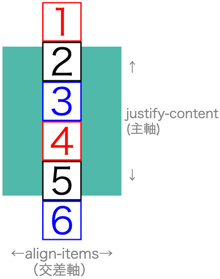
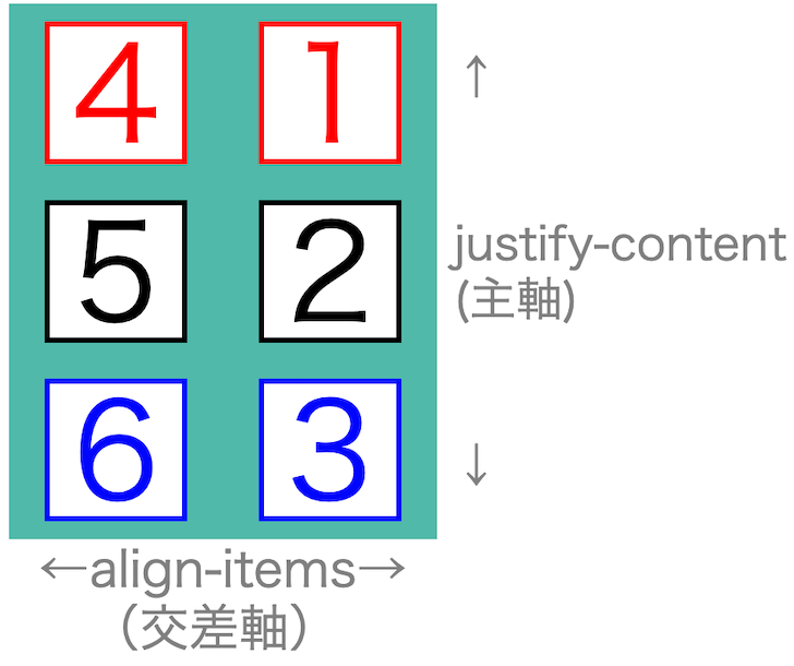
2:justify-content(主軸の調整)
「justify-content」は、主軸の調整プロパティです。
主軸とは並べる方向です。
<ヨコ主軸>
<タテ主軸>
「justify-content」の値は6種類あります。
| 値 | |||
| 1 | flex-start | 前づめ | デフォルト |
| 2 | center | 中央 | |
| 3 | flex-end | 後づめ | |
| 4 | space-around | 均等割2 | |
| 5 | space-between | 両端 | |
| 6 | space-evenly | 均等割1 |
「space-around」がよく使われます。
「justify-content」6つの値
「justify-content」の値です。
それぞれ画像で紹介します。
<ヨコ方向「justify-content」>
ヨコ方向「justify-content」値です。
flex-start(前づめ)

center(中央)

flex-end(後づめ)

space-around(均等割2)

space-between(両端)

space-evenly(均等割1)

<タテ方向「justify-content」>
タテ「justify-content」値です。
flex-start(前づめ)
center(中央)

flex-end(後づめ)
space-around(均等割2)

space-between(両端)

space-evenly(均等割1)

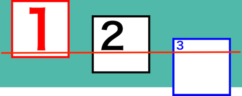
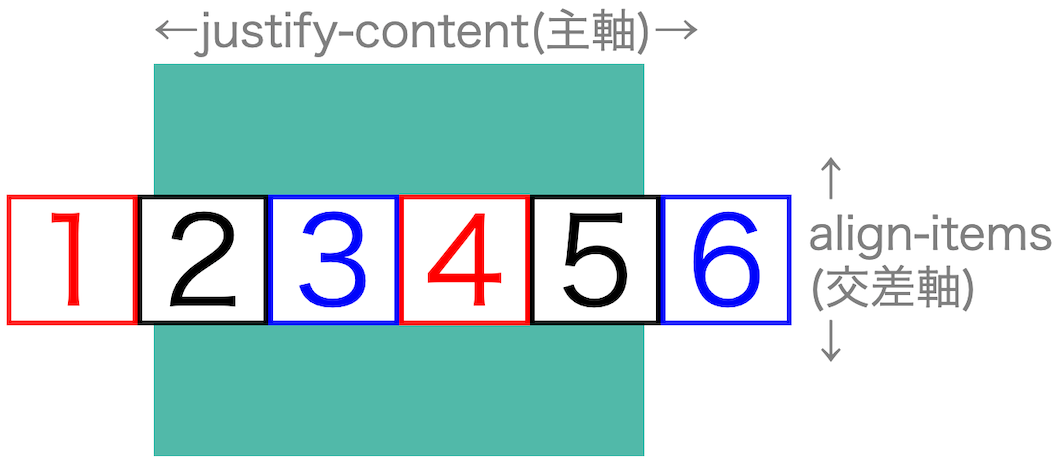
3:align-items(交差軸の調整1)
「align-items」は、交差軸の調整プロパティです。
交差軸とは「主軸の逆方向」です。
<ヨコ交差軸>
<タテ交差軸>
「align-items」の値は5種類あります。
| 値 | |||
| 1 | stretch | 引き延ばす | デフォルト width、heightがautoの時に動作 (auto以外は前づめ) |
| 2 | flex-start | 前づめ | |
| 3 | center | 中央 | |
| 4 | flex-end | 後づめ | |
| 5 | baseline | 文字底そろえ | タテ方向では使えません |
「align-items」は、「center」がよく使われます。
「align-items」6つの値
「align-items」の値です。
それぞれ画像で紹介します。
<ヨコ方向「align-items」>
「align-items」値です。
交差軸は、並びと逆なので「タテの調整」になります。
stretch(引き延ばす)
詳しい説明は「stretchとは」をご覧ください。

flex-start(前づめ)

center(中央)

flex-end(後づめ)

baseline(文字底そろえ)
<タテ方向「align-items」>
「align-items」値です。
交差軸は、並びと逆なので「ヨコの調整」になります。
stretch(引き延ばす)
詳しい説明は「stretchとは」をご覧ください。

flex-start(前づめ)

center(中央)

flex-end(後づめ)

<stretchとは>
少し特殊な値です。
stretchは「width」「height」の状態によって
結果が変わります。
「auto」だと引き伸ばされます。
「auto」以外だと「flex-start」になります。
ヨコ方向「stretch」
| 1 | 2 | 3 | |
| height | auto | 74px | 74px |
タテ方向「stretch」
| width | |
| 1 | auto |
| 2 | 74px |
| 3 | 74px |
4:flex-wrap(折り返し)
「flex-wrap」は、折り返しプロパティです。
折り返しとは、子要素が親要素の範囲内でいっぱいになると
自動で折り返される機能です。
理由はわかりませんが、
折り返し部分での「margin相殺」は起きないようです。
<ヨコ折り返し>
<タテ折り返し>
「flex-wrap」の値は4種類あります。
| 値 | 折り返し | ||
| 1 | nowrap | なし | デフォルト |
| 2 | wrap | あり | |
| 3 | wrap-reverse | 逆 |
「wrap-reverse」を使うと逆方向へ並べることができます。
ですが
並び順は、できるだけ「html」で行いたいところです。
「flex-wrap」4つの値
「flex-wrap」の値です。
それぞれ画像で紹介します。
<ヨコ方向「flex-wrap」>
ヨコ方向「flex-wrap」値です。
nowrap
wrap
wrap-reverse(下から上へ)
<タテ方向「flex-wrap」>
タテ方向「flex-wrap」値です。
nowrap
wrap
wrap-reverse
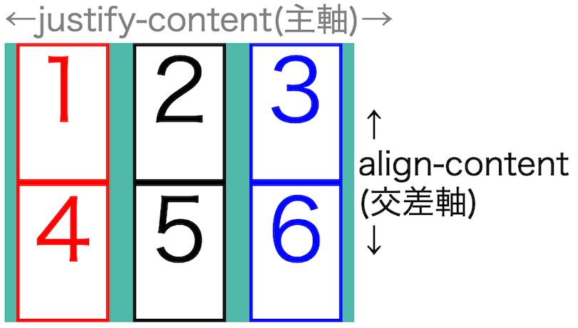
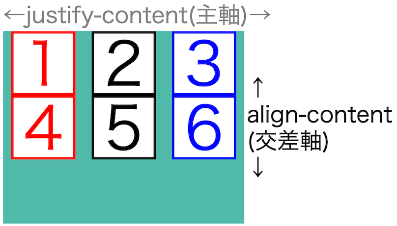
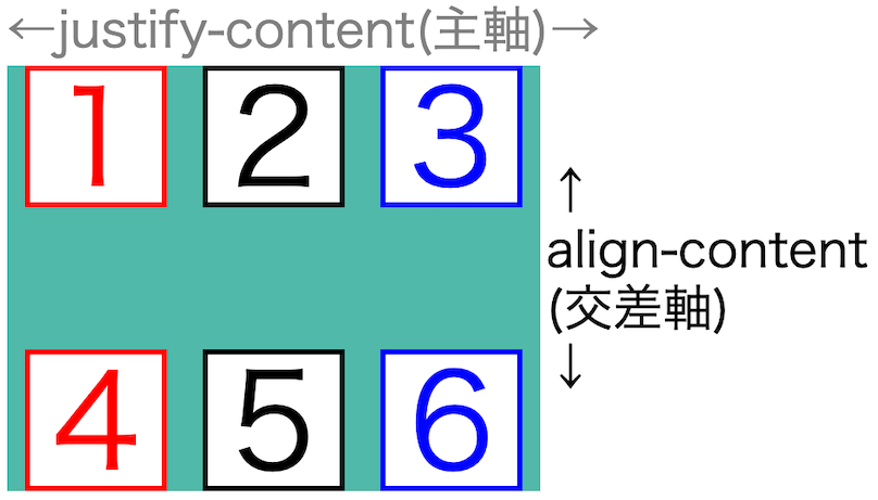
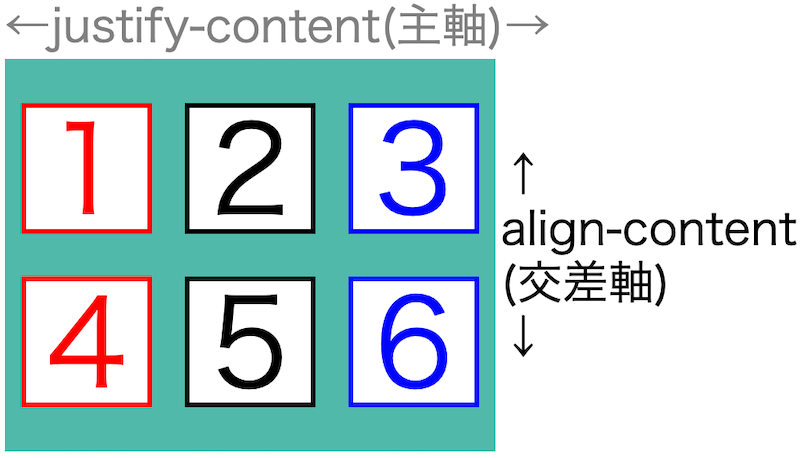
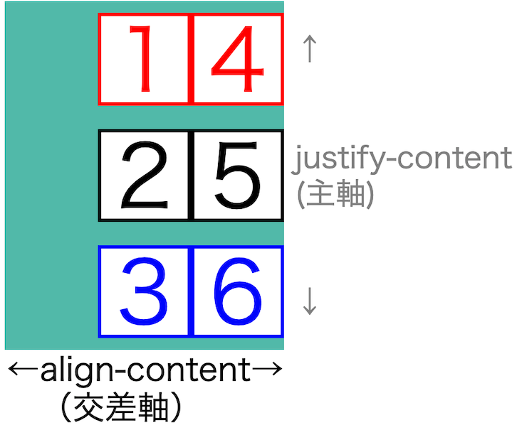
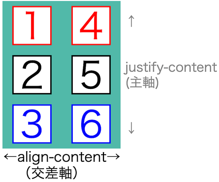
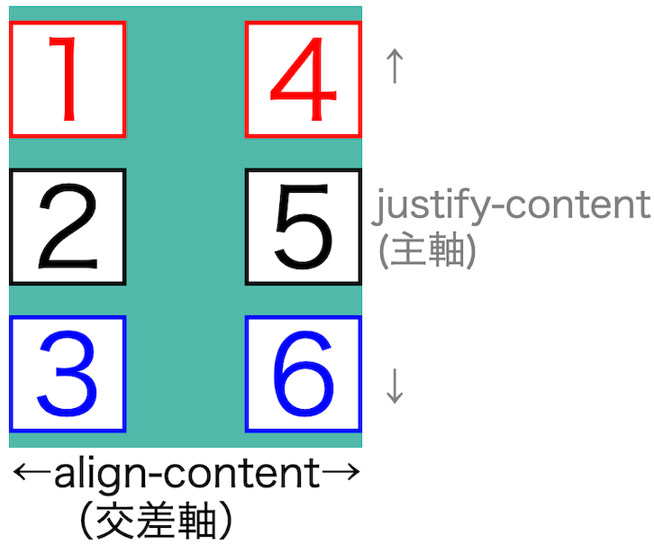
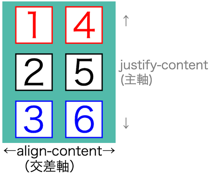
5:align-content(交差軸の調整2)
「align-content」は、交差軸のプロパティです。
<2種類の交差軸>
交差軸のプロパティは2種類あります。
1:align-items(1行)
2:align-content(2行以上)
詳しくは、「align-items」「align-content」2つの違いをご覧ください。
「align-content」の値は7種類あります。
| 値 | |||
| 1 | stretch | 引き延ばす | デフォルト width、heightがautoの時に動作 (auto以外は前づめ) |
| 2 | flex-start | 前づめ | |
| 3 | center | 中央 | |
| 4 | flex-end | 後づめ | |
| 5 | space-around | 均等割2 | |
| 6 | space-between | 両端 | |
| 7 | space-evenly | 均等割1 |
どの値を使うかは、レイアウトで大きく変わります。
「align-content」7つの値
「align-content」の値です。
それぞれ画像で紹介します。
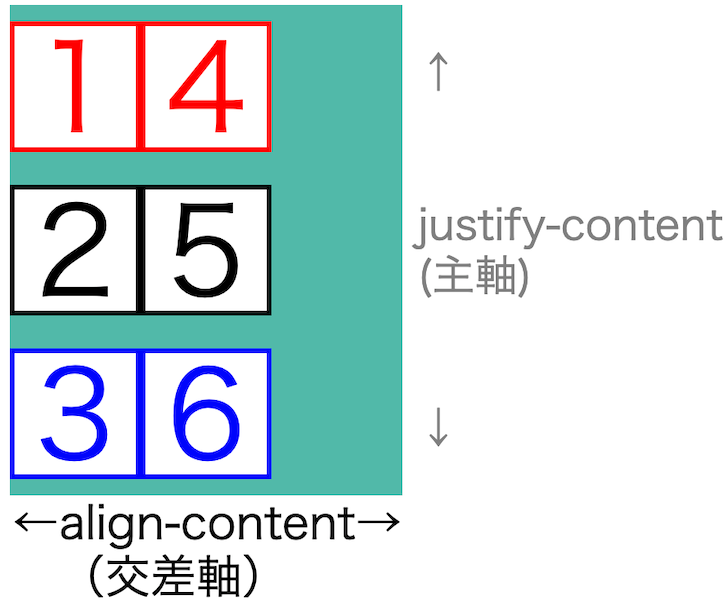
<ヨコ方向「align-content」>
「align-content」値です。
交差軸は、並びと逆なので「タテの調整」になります。
stretch(引き延ばす)
詳しい説明は「align-content」と「stretch」をご覧ください。
flex-start(前づめ)
center(中央)

flex-end(後づめ)

space-around(均等割2)
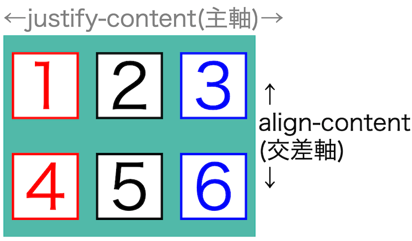
space-between(両端)
space-evenly(均等割1)
<ヨコ方向「align-content」>
「align-content」値です。
交差軸は、並びと逆なので「ヨコの調整」になります。
stretch(引き延ばす)
詳しい説明は「align-content」と「stretch」をご覧ください。
flex-start(前づめ)
center(中央)
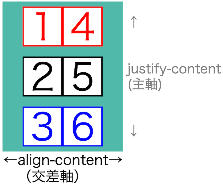
flex-end(後づめ)
space-around(均等割2)
space-between(両端)
space-evenly(均等割1)
<「align-content」での「stretch」>
少し特殊な値です。
stretchは「width」「height」の状態によって
結果が変わります。
「auto」だと引き伸ばされます。
「auto」以外だと「flex-start」になります。
ヨコ方向「stretch」
| height | auto | auto | 80px |
| auto | 80px | 80px |
タテ方向「stretch」
| width | auto | auto |
| auto | 80px | |
| 80px | 80px |
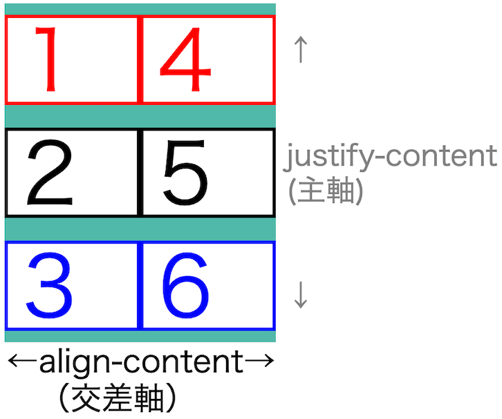
<「align-items」「align-content」2つの違い>
「align-items」「align-content」2つの違いは、
1:align-items = 全て動く
2:align-content = 1行1行で動く
このように違います。
align-items
align-content
折り返しありの時は「align-content」を使うことになるでしょう。
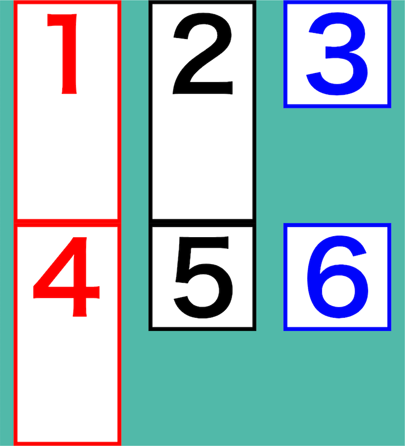
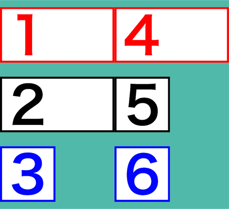
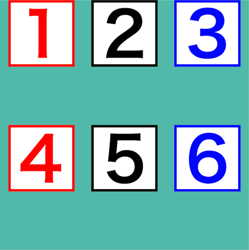
6:order(個別の並び順指定)
「order」は、「並び順を指定する」プロパティです。
おそらく使うことが少ないプロパティでもあります。
理由は、並びは「html」で変えた方が良いからです。
「こんなプロパティあったなー」ぐらいで覚えておいてください。
値は数字のみです。
order: 1;
order: 2;
order: 3;この「order」プロパティは「子要素へ入れて」使います。
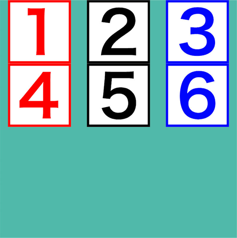
<「order」使用例>
「orderの値」には、どんな数字でも使えます。
ですが
数字の小さい順番に並びます。

html
<div class="box01">
   <h2 class="sample01">1</h2>
   <h2 class="sample02">2</h2>
   <h2 class="sample03">3</h2>
</div>
css
.sample01 {
  order: 2;

  width: 80px;
  height: 80px;

  font-size: 74px;
  color: red;
  border: red solid 3px;
  background-color: white;
}

.sample02 {
  order: 1;

  width: 80px;
  height: 80px;

  font-size: 74px;
  color: black;
  border: black solid 3px;
  background-color: white;
}

.sample03 {
  order: 3;

  width: 80px;
  height: 80px;

  font-size: 74px;
  color: blue;
  border: blue solid 3px;
  background-color: white;
}
「flexboxプロパティ群」まとめ
「flexbox」とは「子要素をキレイに並べるプロパティ」です。
<「flexbox」6種のプロパティ>
1:flex-direction(方向を決める)
2:justify-content(主軸の調整)
3:align-items(交差軸の調整1)
4:flex-wrap(折り返し)
5:align-content(交差軸の調整2)
6:order(個別の並び順指定)
<1:flex-direction(方向を決める)>
| 値 | 方向 | 並び方向 | ||
| 1 | row | ヨコ | → | デフォルト |
| 2 | row-reverse | ヨコ逆 | ← | |
| 3 | column | タテ | ↓ | |
| 4 | colmn-reverse | タテ逆 | ↑ |
<2:justify-content(主軸)>
| 値 | |||
| 1 | flex-start | 前づめ | デフォルト |
| 2 | center | 中央 | |
| 3 | flex-end | 後づめ | |
| 4 | space-around | 均等割2 | |
| 5 | space-between | 両端 | |
| 6 | space-evenly | 均等割1 |
<3:align-items(交差軸1)>
| 値 | |||
| 1 | stretch | 引き延ばす | デフォルト width、heightがautoの時に動作 (auto以外は前づめ) |
| 2 | flex-start | 前づめ | |
| 3 | center | 中央 | |
| 4 | flex-end | 後づめ | |
| 5 | baseline | 文字底そろえ | タテ方向では使えません |
<4:flex-wrap(折り返し)>
| 値 | 折り返し | ||
| 1 | nowrap | なし | デフォルト |
| 2 | wrap | あり | |
| 3 | wrap-reverse | 逆 |
<5:align-content(交差軸2)>
| 値 | |||
| 1 | stretch | 引き延ばす | デフォルト width、heightがautoの時に動作 (auto以外は前づめ) |
| 2 | flex-start | 前づめ | |
| 3 | center | 中央 | |
| 4 | flex-end | 後づめ | |
| 5 | space-around | 均等割2 | |
| 6 | space-between | 両端 | |
| 7 | space-evenly | 均等割1 |
<6:order(個別の並び順指定)>
css(子要素)
.sample01 {order: 2;}

.sample02 {order: 1;}

.sample03 {order: 3;}
レスポンシブページ専用の「flexboxプロパティ」は、
以下の記事をご覧ください。
「flex-basis」「flex-grow」「flex-shrink」の記事はこちら
以上、
これでスッキリ?「flexboxプロパティ群」を徹底解説(html,css)
の話でした。
ありがとうございました。